FLEX布局
网页布局是每个前端开发人员都会面对的,传统的布局方式我们往往会采用 display position float 这些 css 属性,但是面对日益增多且尺寸差异明显的移动设备上,我们发现这些 css 属性给我们带来了很多破坏性的问题,玩玩有些用户的手机上布局是好的,但是另外一些却是坏的,所以 flex 布局也呼之既出
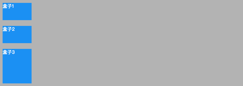
flex 布局也叫 弹性布局,体现在它能够自动的伸缩来适应不同的页面尺寸,比如我们要完成这样一个布局:
flex 很简单的就能帮我们搞定他,我们只要告诉父盒子你是一个弹性盒子(display: flex),然后告诉子元素你们在盒子中每个人只占了一等份(flex: 1)呢,这样子元素就会老老实实的占据着属于它的位置
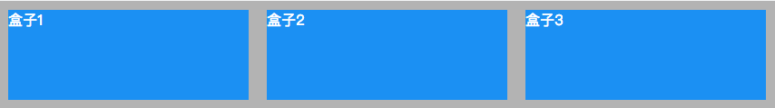
html:
<div class="father">
  <div class="child1">盒子1</div>
  <div class="child2">盒子2</div>
  <div class="child3">盒子3</div>
</div>
css:
.father {
  background-color: #b3b3b3;
  display: flex;
}
.father > div {
  background-color: #1C90F3;
  color: #fff;
  height: 100px;
  width: 100px;
  flex: 1;
  margin: 10px;
}
但是这样会有人说这个不行,太简单了,我一个width: 33.3%就能搞定,诚然,这样确实能够完成,那么我们来试试把 .child3 的flex属性变成2看看会发生什么:
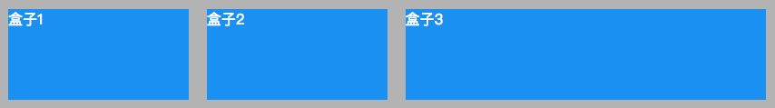
是不是很神奇,.child3自动占据了盒子的2等份
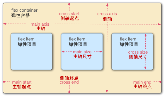
在 flex 布局中有行(row)和列(column)之分,这也决定了盒子中元素的排列方式,并且它会受到元素的 dir 属性影响:
<div dir="ltr"></div>   // left to right
<div dir="rtl"></div>   // right to left
flex 也可以让我们来设定布局的方向
flex-direction: row | row-reverse | column | column-reverse
默认是水平从左到右来排列,但是也可以垂直排列,这样的布局方式给我们带来了很大的便利性